'BOXER SHORTS 2003 IMAGE PROGRESSION PAGE
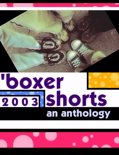
Image above is without logo's additional text or images. It is also
at a smaller size than the original file, due to restriction in the
Trellix Web program.
I have gone for a more retro, a little bit more quirky, look to things.
The photo at the top (snatched from WWdN) is not yet finished, though
even now it still contains three different layers.
I intend for the finished cover to be made smalled and planted at their feet,
so that it's sort of like one of those album covers that goes on... and on...
into itself, like an infinity mirror.

Email me, and let me know what you think.
TH/SQ
*************************************************************************************
Above is the second mock-up. I may very well do something with the original image of the first book, to give this one some continuity. The feet on the left depict humans... the feet on the right depict monkeys.
I found a font that looked very much like the original, and used that for the title. 'redux' and 'edited by...' are slightly different fonts.
If I can take the original image of the first boxer book, and spruce it up a little, that would be cool. So, then, the only change would be with the surrounding stuff. Hmmm... but that would require a .300dpi copy of the original front cover...
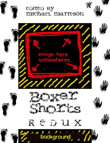
Where On Earth Is Thumper???
EDIT: Where it says 'background' I think I'll keep black and drop in there 'an anthology' in red. That keeps it even more in tune with the original. What I'm looking at now, is for the two to look sortta similar when they're put together. I know that's a total opposite to what I said 6 days ago, but hey, I'm just that sortta fucked-up guy...
DOUBLE EDIT: Remember the WHERE'S WALLY things? Well, see if you can spot the Inkblot logo in there...
***********************8
Below is quick mock-up 3:

Of course, you're getting it at about 40% of the actual size, and far less quality. The image in the centre, I hope, will be much bigger when I do it for real. Of course if I am provided with a .300 dpi image, then blowing that up a bit won't be a problem.
The above just gives you a very rough idea of what I'm thinking about.
*******************************
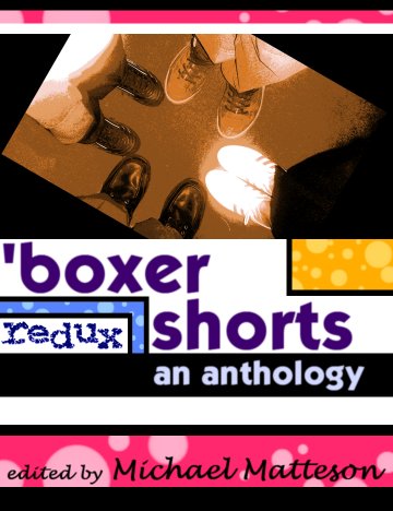
Okay, here is what I think is nearing the final draft of this cover. What you see below is a 50% size version of the image, which is 13 inches by 10 inches, and about 2000dpi.
I think... anyway, it's over 300.
The photo was shot this morning. To keep in with the retro-styling of the cover, I have really posterised it, and toned it using two seperate layers. I air-brushed out some of the things I didn't want, and then rotated it right 30 degress. But, other than that, it's unedited.
Keep it simple. After all, what's going on around it is mad enough.